Case Study
Overview:
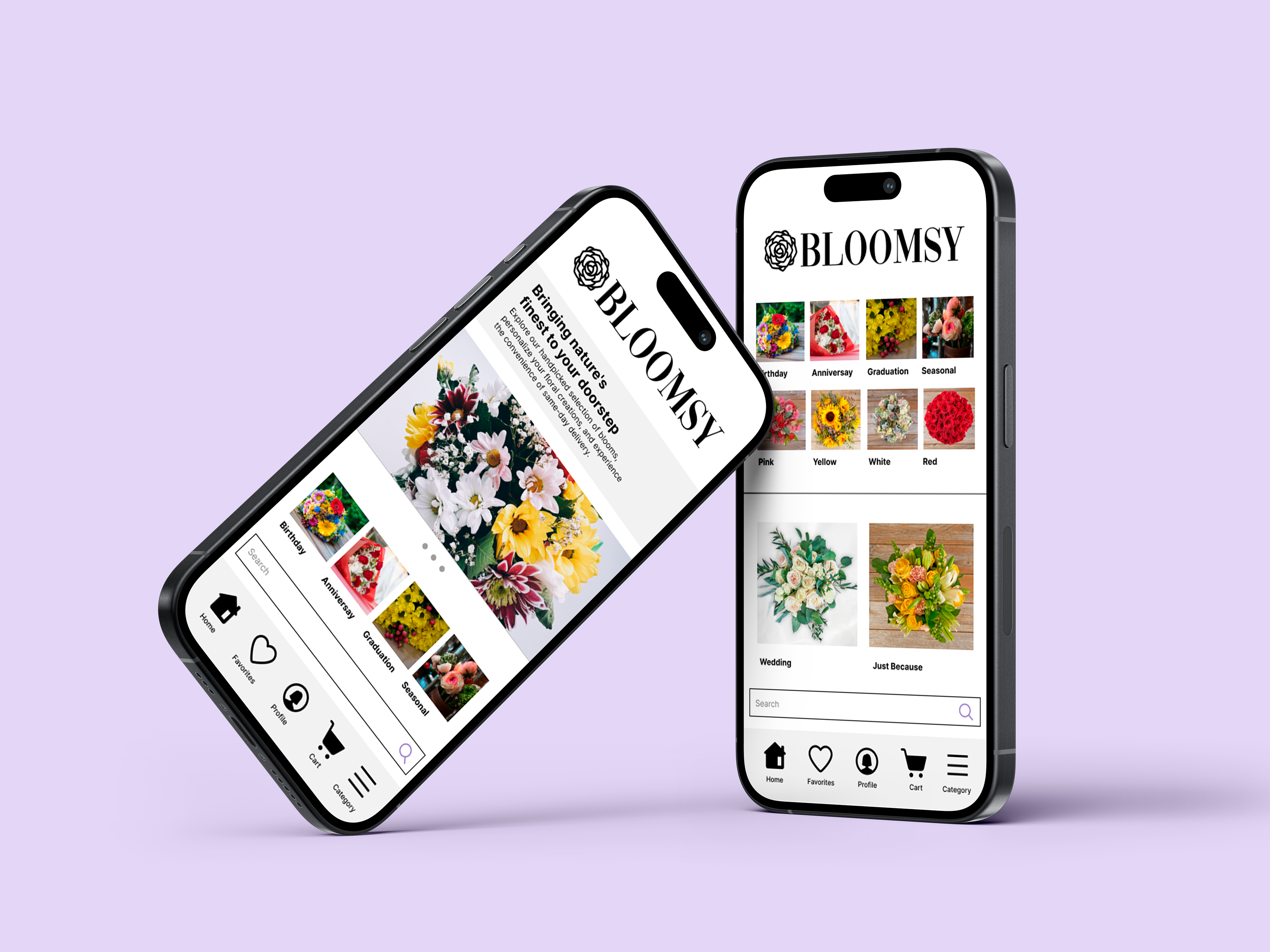
Bloomsy is a florist application designed to streamline the ordering process, ensuring both efficiency and affordability, all while offering an extensive and diverse selection of floral arrangements.
This app was designed during the completion of the Google UX Design Professional Certificate via Coursera.
Role:
Product Designer
Product Strategy, User Research, Interaction, Visual design, Prototyping & Testing
Product Strategy, User Research, Interaction, Visual design, Prototyping & Testing
2023
click to open on mobile
Understanding The Problem:
I conducted interviews and empathy maps to understand the users I’m designing for and their needs. A primary user group identified through research was working adults in relationships struggling to find a florist platform that meets their needs.
The user group confirmed initial assumptions about the needs of the app users but research also revealed that price, usability, shipping and selection were challenges in finding a reliable florist app.
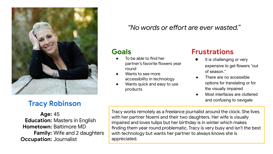
Bloomsy App User Persona
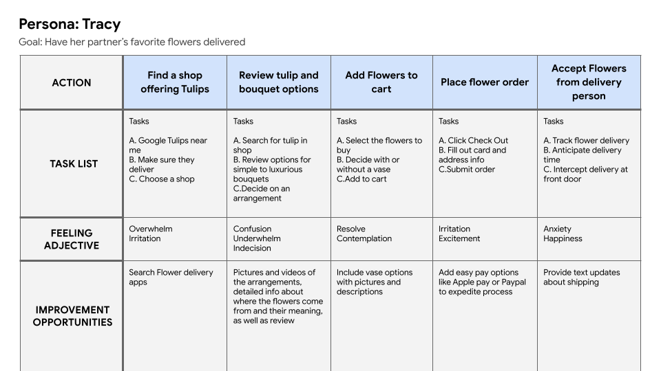
Bloomsy App Journey Map
Understanding the User:
Problem statement:
Tracy is a working adult who needs an easy to use florist platform with a variety of options because she likes to order specialty flowers regularly for her wife.
Mapping Tracy’s user journey revealed how helpful it would be for users to have a dedicated floral catalogue app with a large selection of specialty flowers.
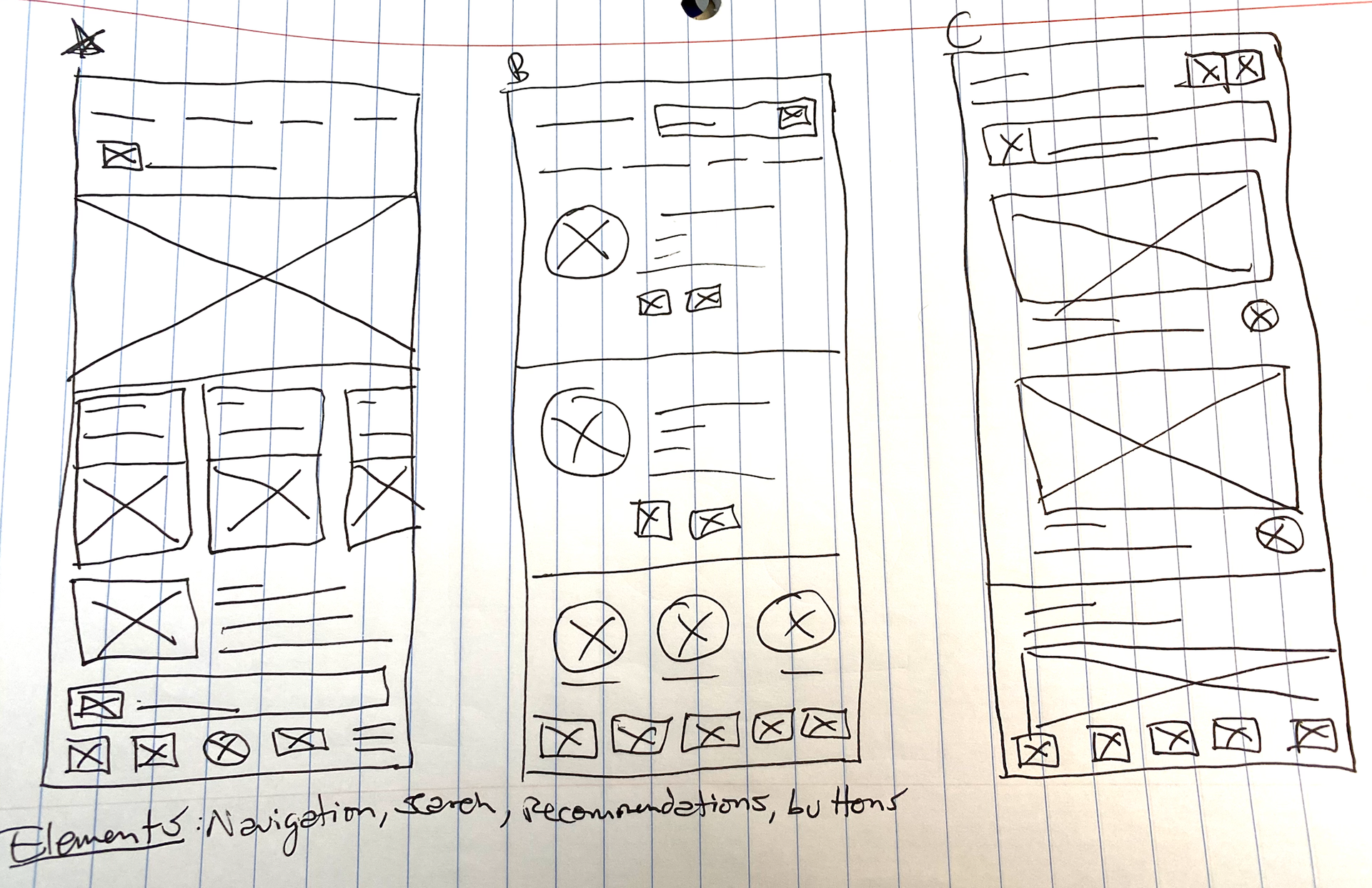
Initial Lo-Fi Wireframe Brainstorm
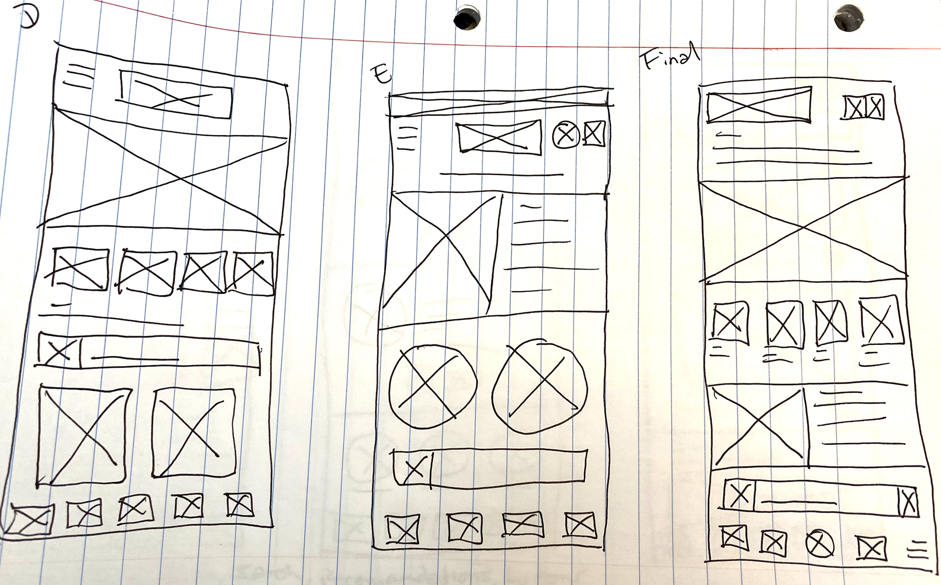
Initial Lo-Fi Wireframe Brainstorm
Development:
During this process I considered popular shopping applications and used some of their features for inspiration for the Bloomsy App. Then I took the best aspects from the other five versions to create the final version of the homepage.
From there, the digital wireframes were fleshed out along with the low fidelity prototype.
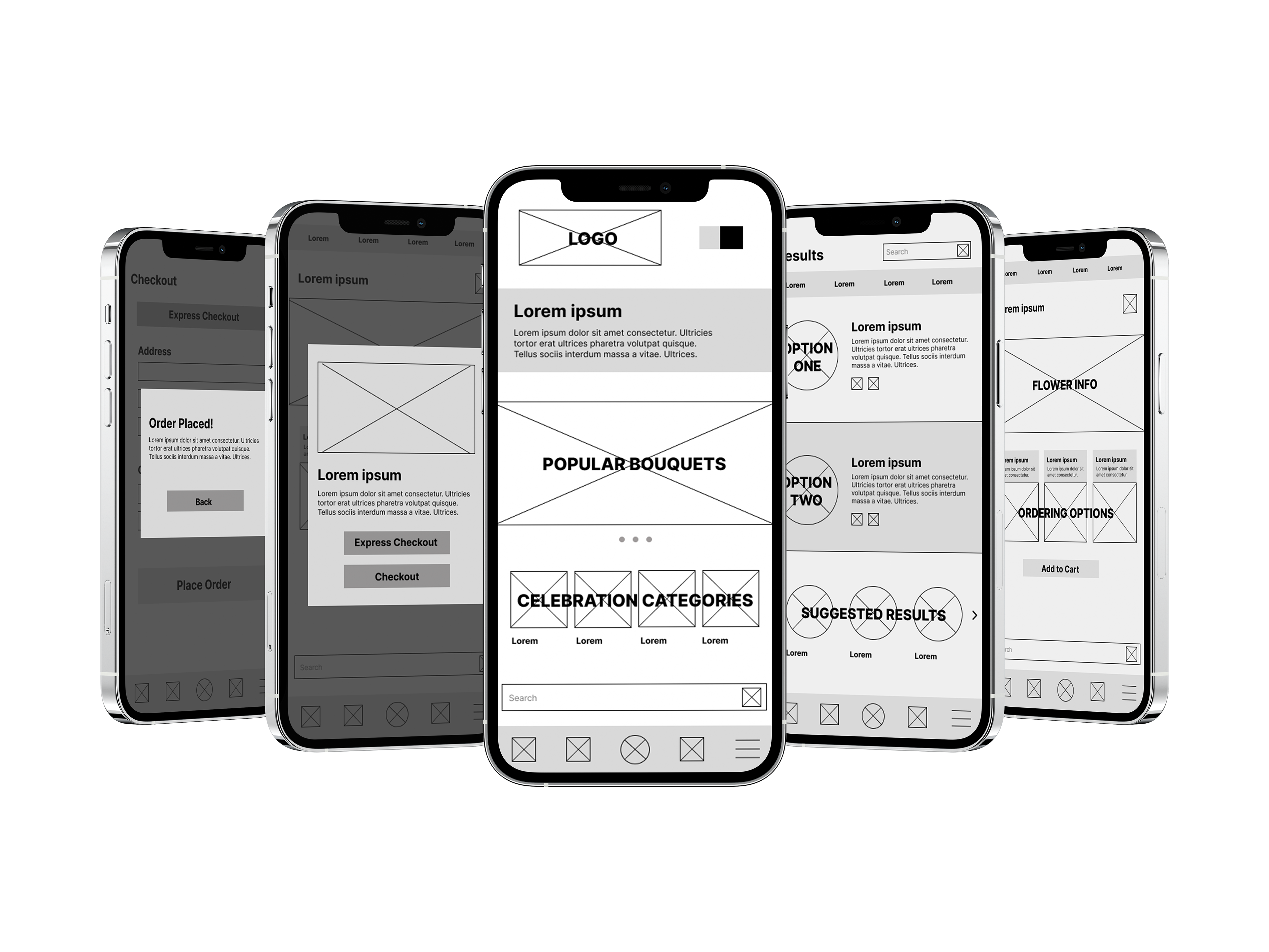
Wireframe Mockup
Usability:
The goal was to figure out what specific difficulties users encounter when they try to complete the core tasks of the Bloomsy app such as item selection, ordering, and in-app navigation.
-Based on the theme that: for most users, it’s not immediately clear how to create a profile, an insight is: users need better cues for what steps are required to create a profile.
-Based on the theme that: having limited navigation options appeals to some but not all users, an insight is: creating more ways for users to reach the same action can increase accessibility.
-Based on the theme that: not everyone is familiar with the dimensions for multiple bouquet sizes, an insight is: use accessible options that help users understand the different sizes.
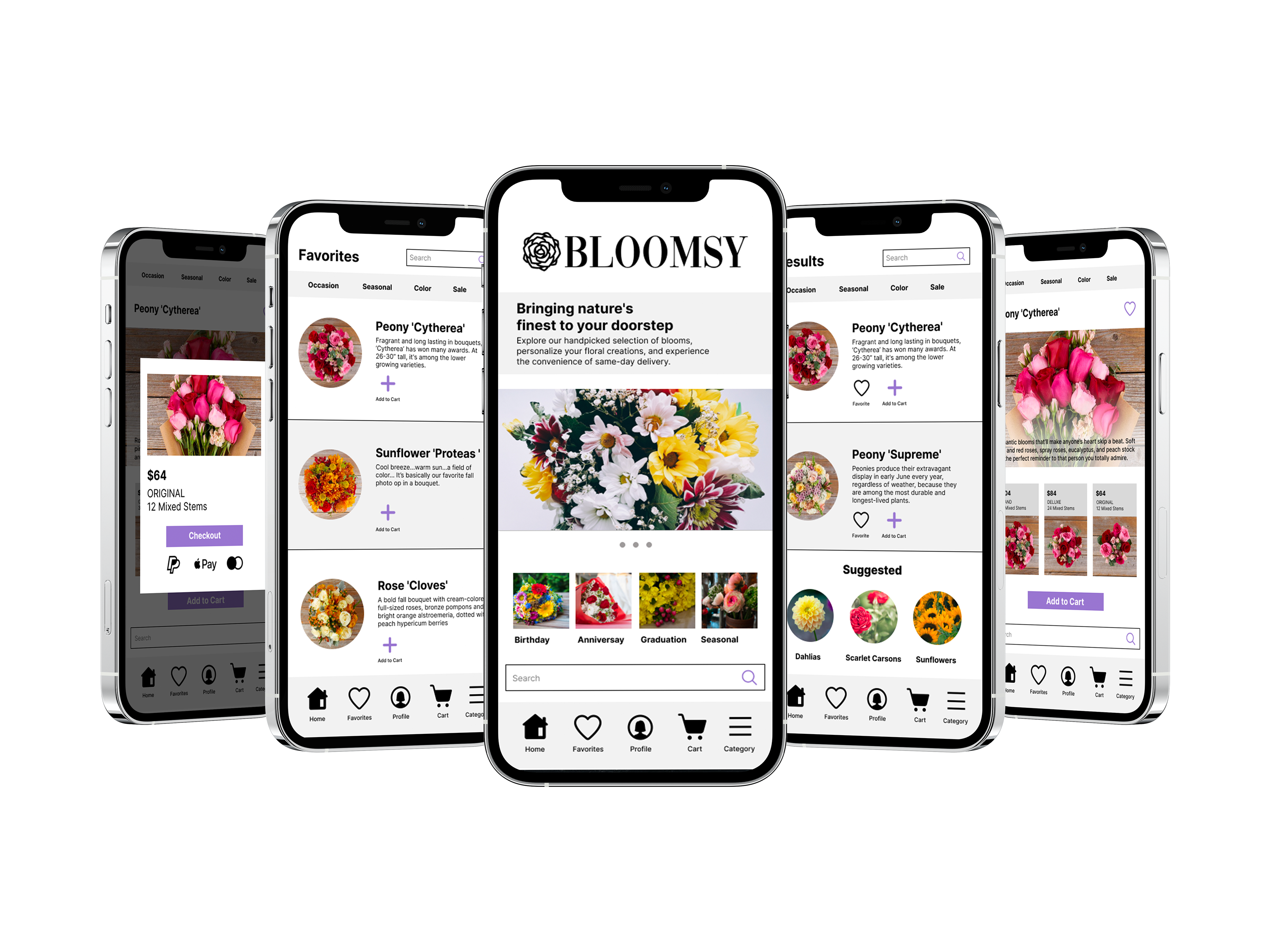
Prototype Mockup
Accessibility Considerations:
-Color contrast was taken into account as well as users with color blindness to create the palette for Bloomsy.
-All images and icons have text descriptions to aide non native english speakers and those using screen readers.
-Each page interaction is an accessible speed, not too fast or elaborate, as to avoid disorienting or confusing any users.
Impact:
By prioritizing intuitive navigation and a clean, visually appealing interface, the app successfully caters to a wide range of users. The key takeaway is that a thoughtful UX design strategy can transform a complex process into a simple, enjoyable, and efficient experience.
What I learned:
I recognize the importance of usability testing in fine-tuning the design. Usability testing ensures that real users' feedback is incorporated, addressing pain points and refining the user experience to meet the diverse needs of the target audience, ultimately leading to a more effective and user-friendly product.
