Case Study
Overview:
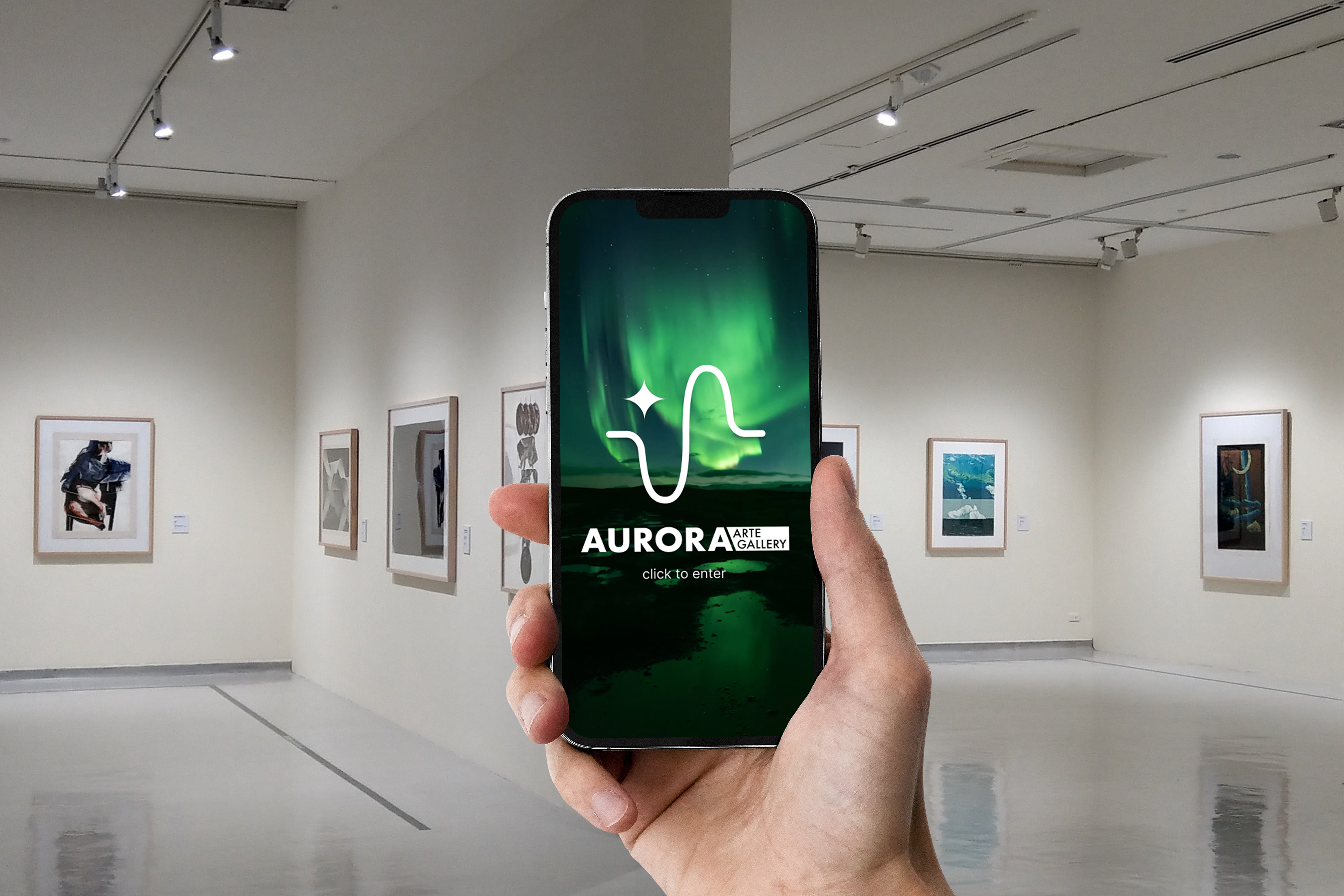
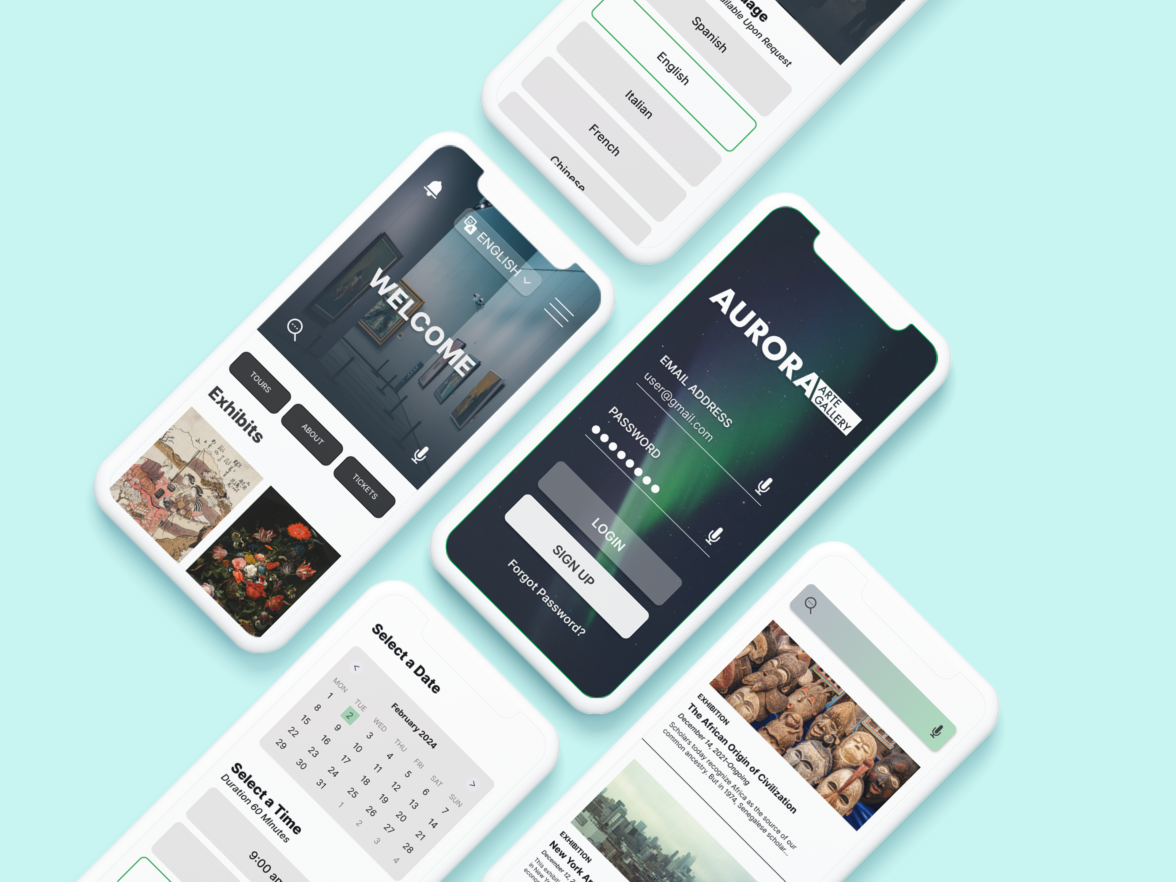
Aurora Art Gallery is the easiest way to keep up to date with events/exhibits going on at the museum. This platform will make it easy to book tickets, sign up for membership rewards, and sign up for calendar reminders.
This project was designed during the completion of the Google UX Design Professional Certificate via Coursera.
Role:
Product Designer
Product Strategy, User Research, Interaction, Visual design, Prototyping & Testing
Product Strategy, User Research, Interaction, Visual design, Prototyping & Testing
2023
click to open on mobile
Understanding The Problem:
I conducted interviews and empathy maps to understand the users I’m designing for and their needs. A primary user group identified through research was working adults with busy schedules want to be able to keep up with local exhibits and quickly book tickets.
The user group confirmed initial assumptions about the needs of the app users but research also revealed that useful reminders, usability, accessibility and membership opportunities were challenges normally had with museum apps.
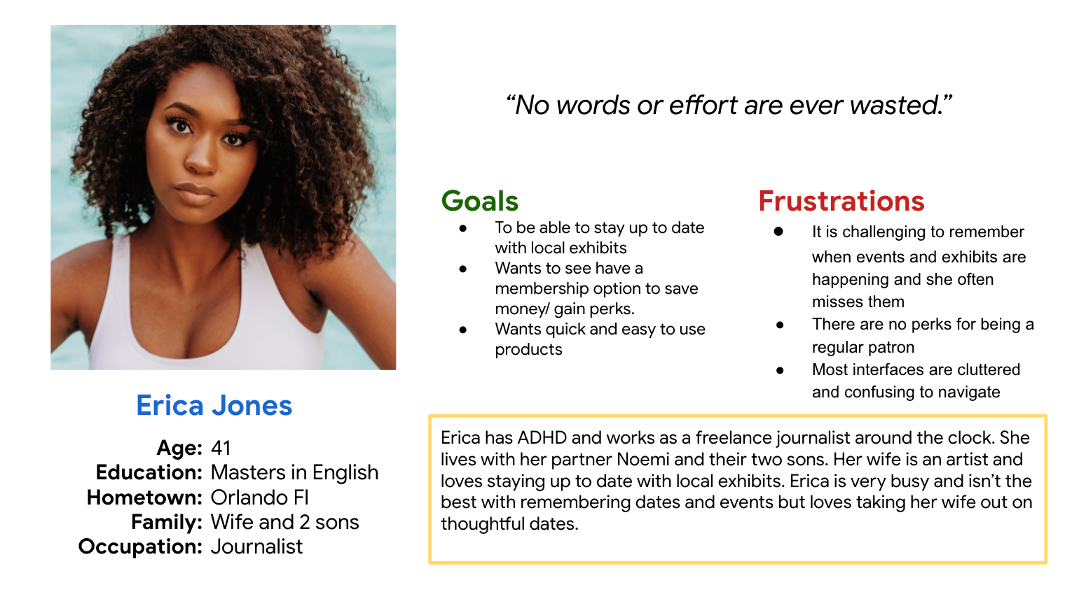
AAG User Persona
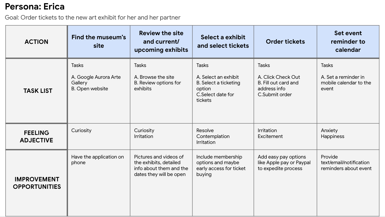
AAG Journey Map
Understanding the User:
Problem statement:
Erica is a working adult who needs an easy to use museum platform with a reminder setting and membership options so she can take her wife and kids regularly.
Mapping Erica’s user journey revealed how helpful it would be for users to have a dedicated museum app promoting new and upcoming exhibits.
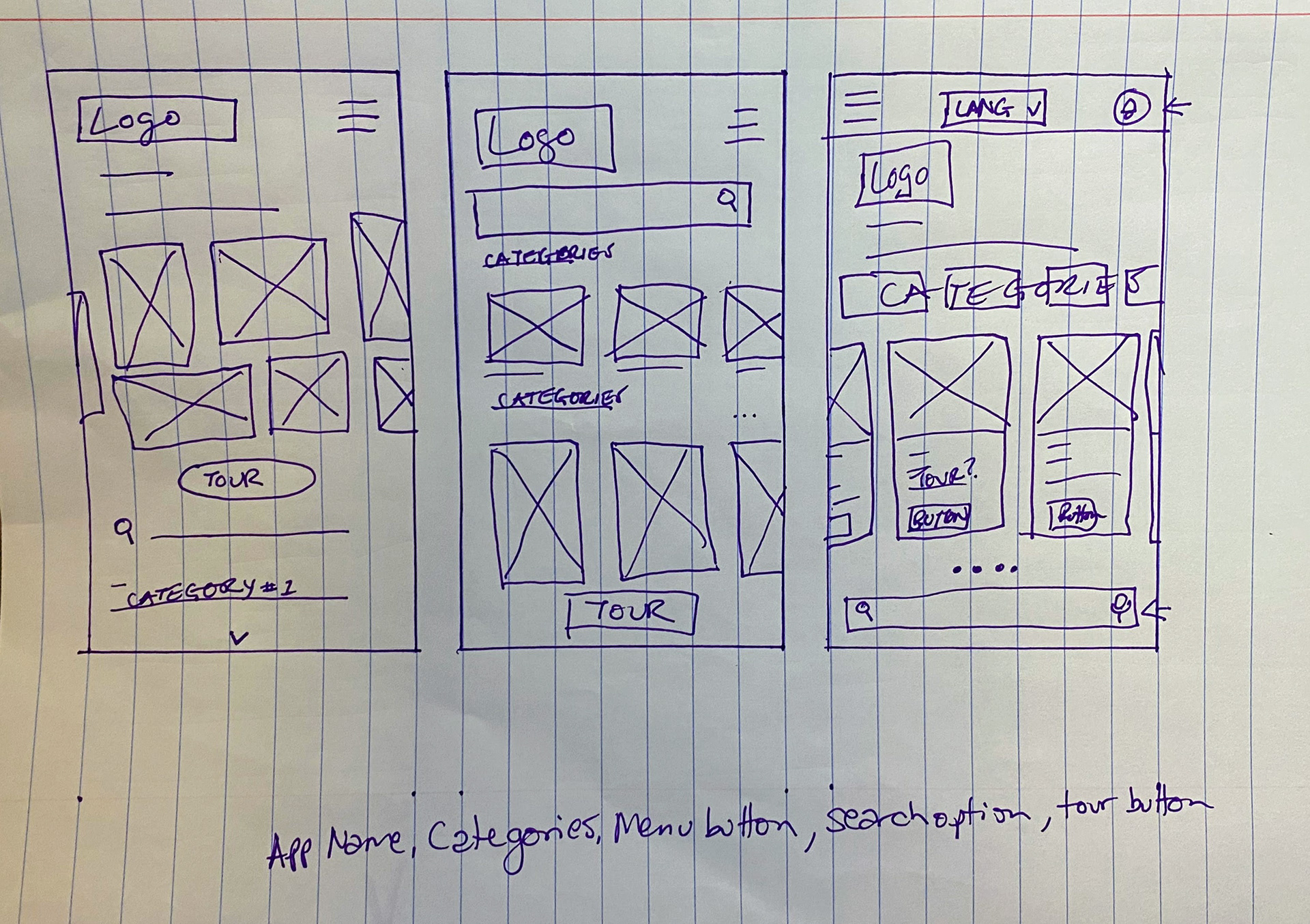
Initial Lo-Fi Wireframe Brainstorm
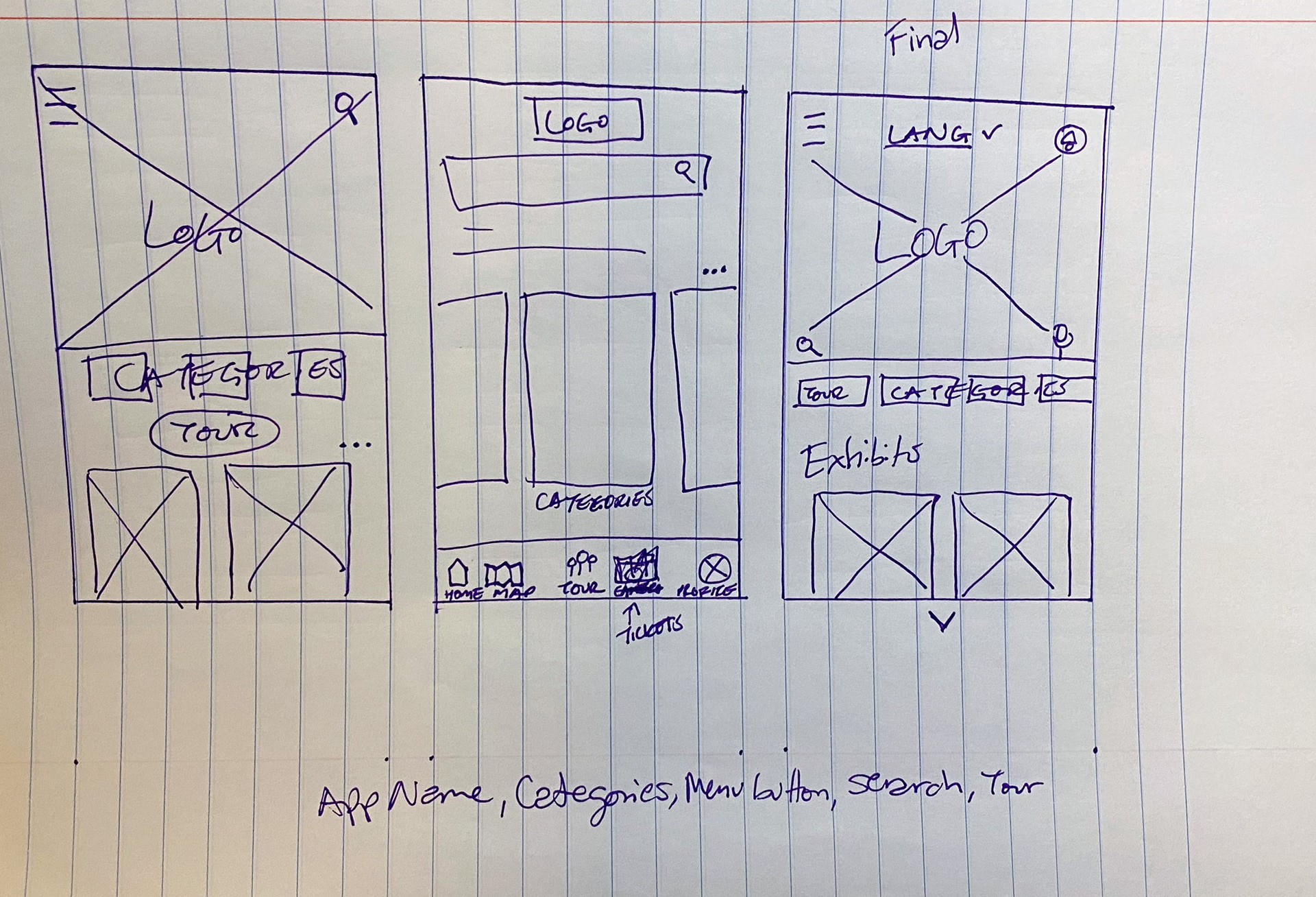
Initial Lo-Fi Wireframe Brainstorm
Development:
During this process I considered popular museum platforms and used some of their features for inspiration for Aurora Arte Gallery. Then I took the best aspects from the other 5 versions to create the final version of the homepage.
From there, the digital wireframes were fleshed out along with the low fidelity prototype.
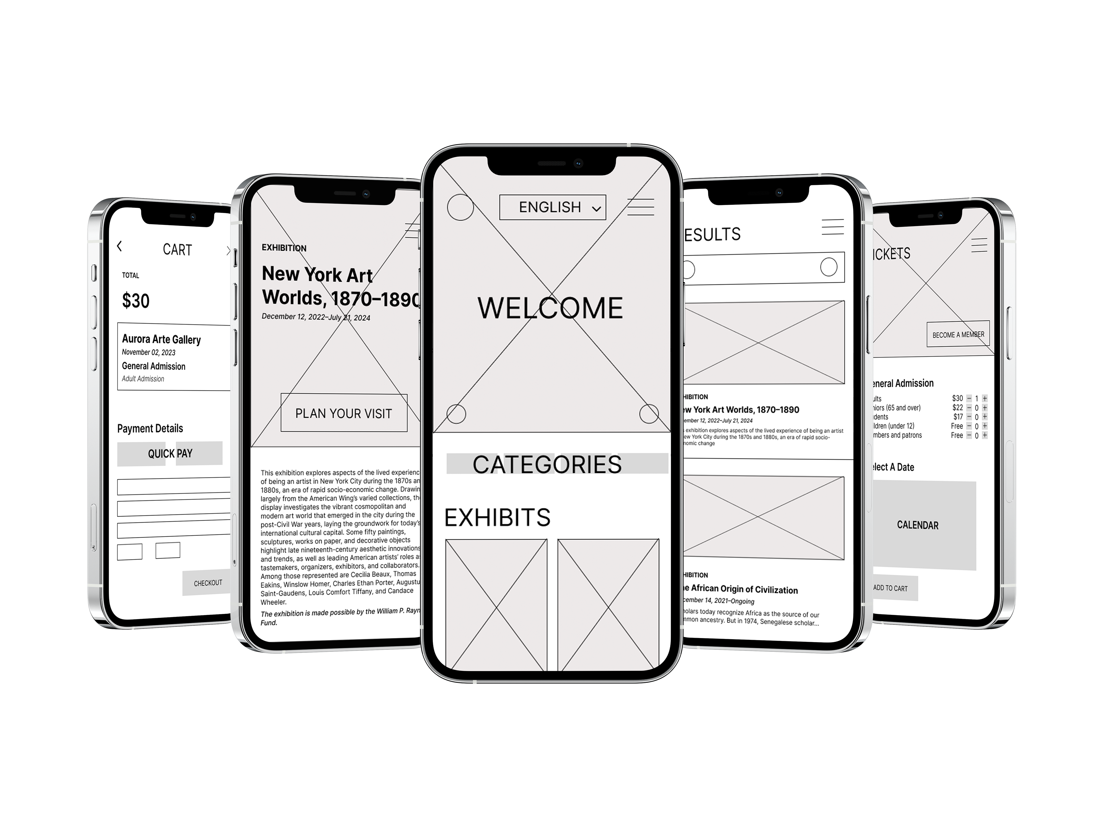
Wireframe Mockup
Usability:
The goal was to figure out what specific difficulties users encounter when they try to complete the core tasks of the Aurora app such as membership sign up, ticket ordering, and in-app navigation.
-Based on the theme that: for most users, it’s not immediately clear how to become a member, an insight is: users need better cues for what steps are required to become a member.
-Based on the theme that: having limited navigation options appeals to some but not all users, an insight is: creating more varied information architecture can increase application usability.
-Based on the theme that: for many users, they are visually impaired or their first language is not english, an insight is: creating options for speak to text, audio for large text sections, and options for users to select different languages will increase accessibility.
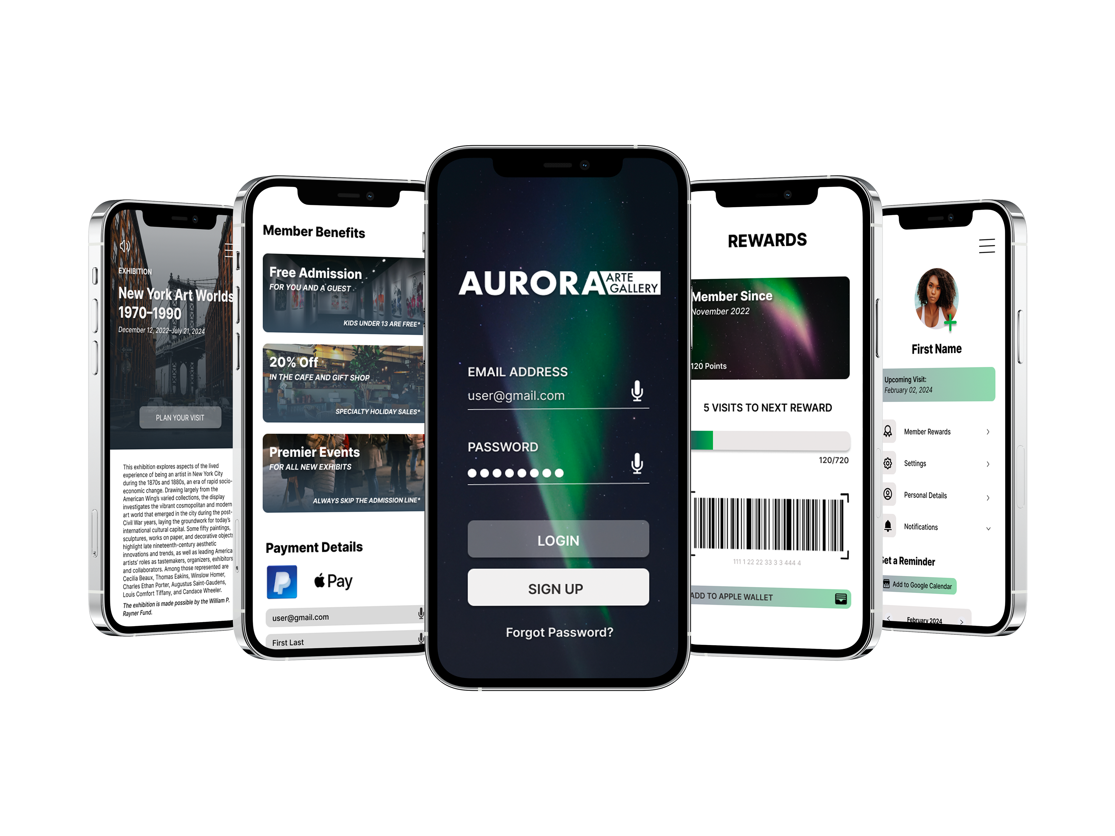
Prototype Mockup
Accessibility Considerations:
-Color contrast was taken into account as well as users with color blindness to create the palette for Aurora Arte Gallery.
-Text size, spacing and readability was taken into consideration several times over to find what worked best for different user groups.
-All text input fields have the option for speak to text, large text sections have the option for audio, and the application as well as tour languages can be changed for non native english speakers.
-The information architecture for Aurora allows for multiple ways to obtain similar results to make user flow smooth for all users.
Impact:
The incorporation of user-friendly features, such as clear pathways for membership sign-up and streamlined ticket ordering, reflects a commitment to addressing specific user needs. Furthermore, the design embraces a varied information architecture, striking a balance between limited navigation options for simplicity and a more expansive structure to accommodate different user preferences.
Recognizing the importance of accessibility, the inclusion of features like speak-to-text, audio support for extensive text sections, and language customization options reflects a commitment to inclusivity. Overall, the thoughtful UX design of Aurora Arte Gallery aims to elevate the user's interaction with art, transforming it into a visually enriching and enjoyable journey.
What I learned:
During the design process I focused on how crucial usability testing is for tweaking the design. Having sessions with real users, getting their feedback, and improving the app slowly. Through this process, I tweaked different tasks like signing up for membership, ordering tickets both for users and guests, graphical representation, text readability, and navigation many times over. By fine-tune the user experience and improving considerations for accessibility I feel that the Aurora application has come together nicely.
